Ralla
Identity & digital experience
Identity & website direction
Home & water care
Water, understood.
Ralla
The project
Ralla needed a way to explain a considered home product without losing people in specifications and promotional noise. The direction brings the brand closer to the daily ritual it serves: a glass of water, a familiar kitchen, a little more confidence in the choice.
- The brief
- Water purification is technical. Choosing it should feel human.
- Our contribution
- Brand evolution
Visual guidelines
Campaign art direction
Website design
The thinking
Water purification is technical. Choosing it should feel human.
01 / Direction
A simpler starting point.
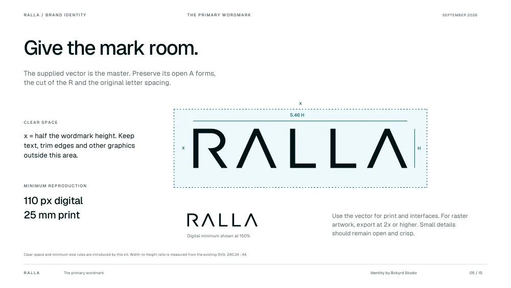
The identity moves from a layered, emblem-led presentation to a geometric wordmark with room to breathe. The cut R and open A forms give Ralla a recognisable silhouette. Consistent spacing and quiet layouts let that small set of decisions do more of the work.
02 / Design
Bring the product into real life.
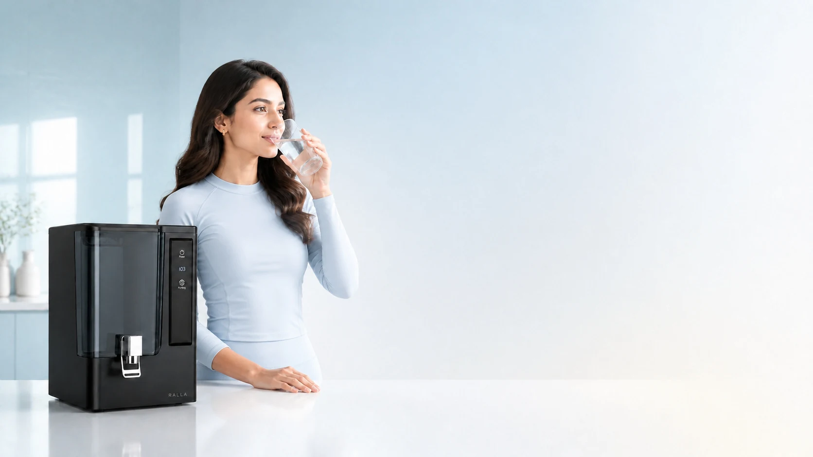
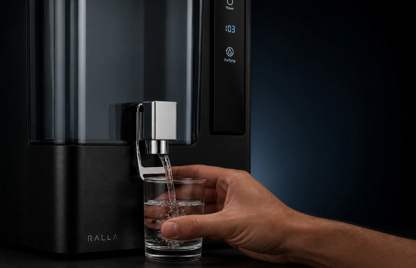
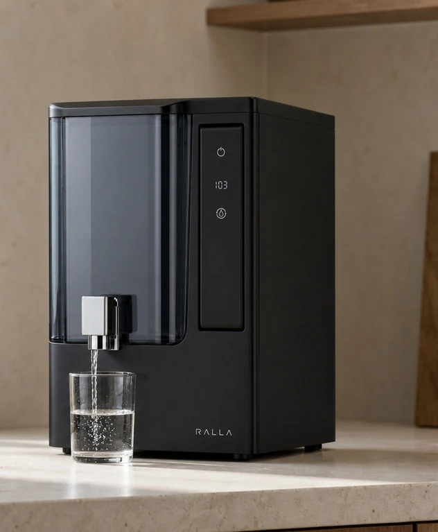
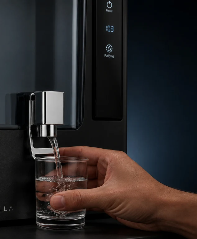
Pale blue clothing, natural gestures, glass and domestic stone establish the campaign language. The art direction places the purifier in a home context, then moves closer to the gesture of pouring. The product remains visible without taking over the whole story.
03 / In use
One language, from discovery to care.
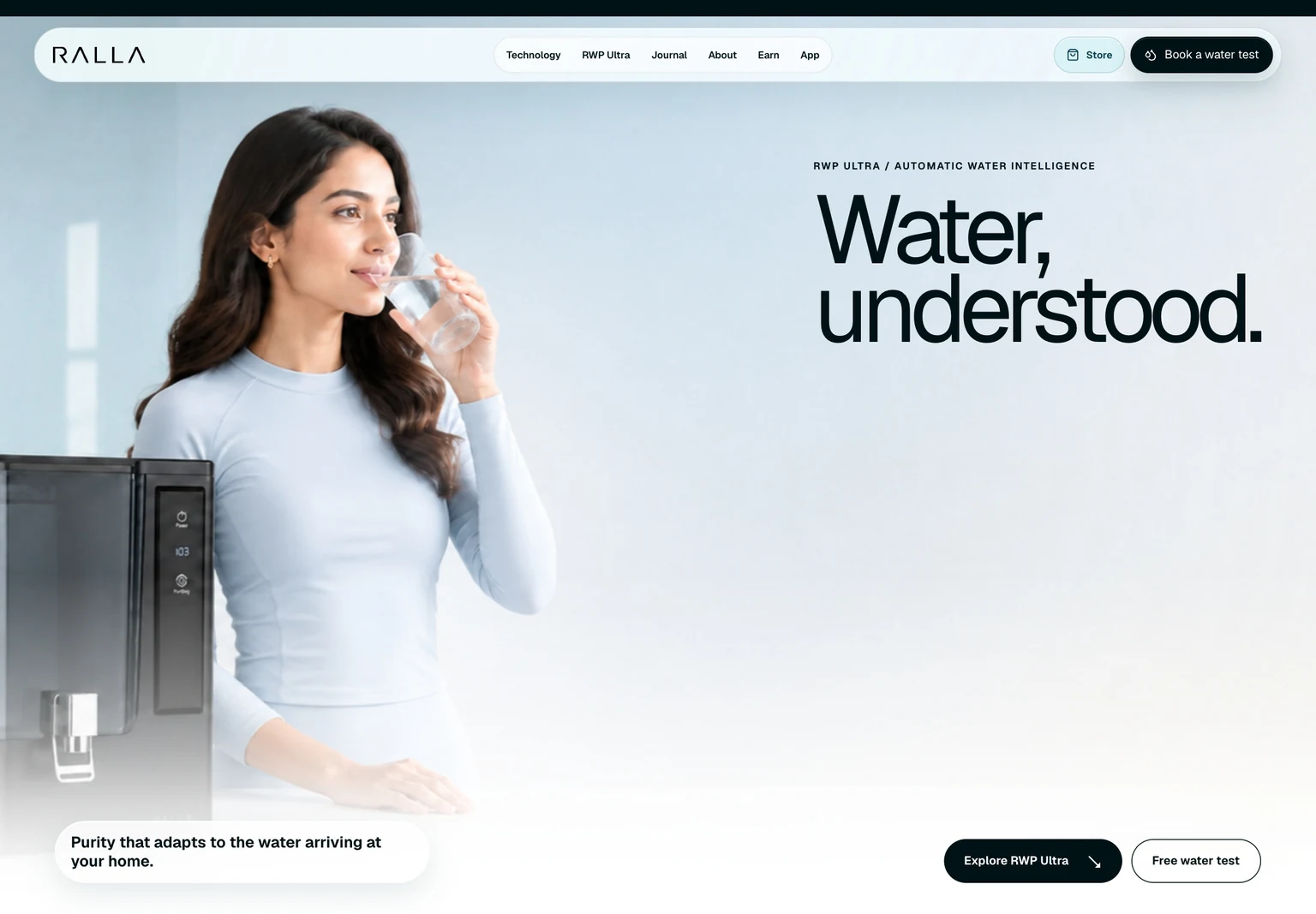
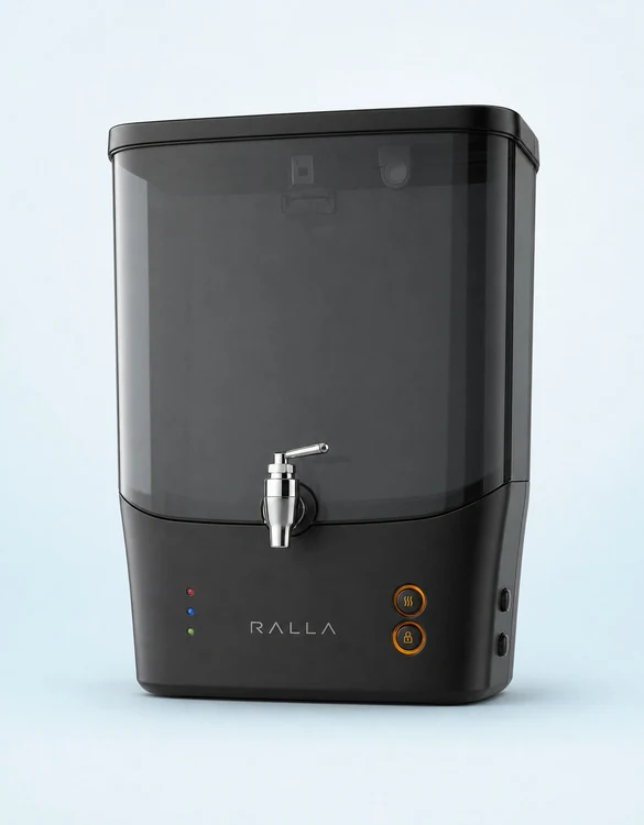
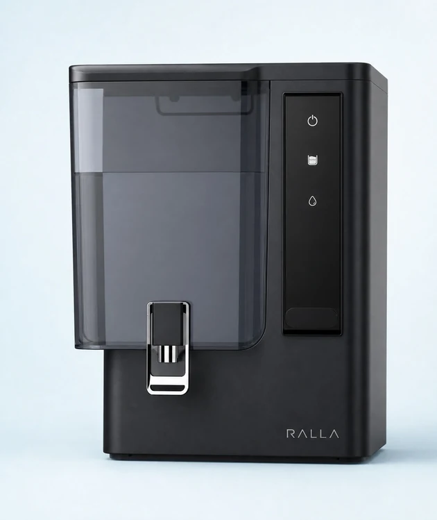
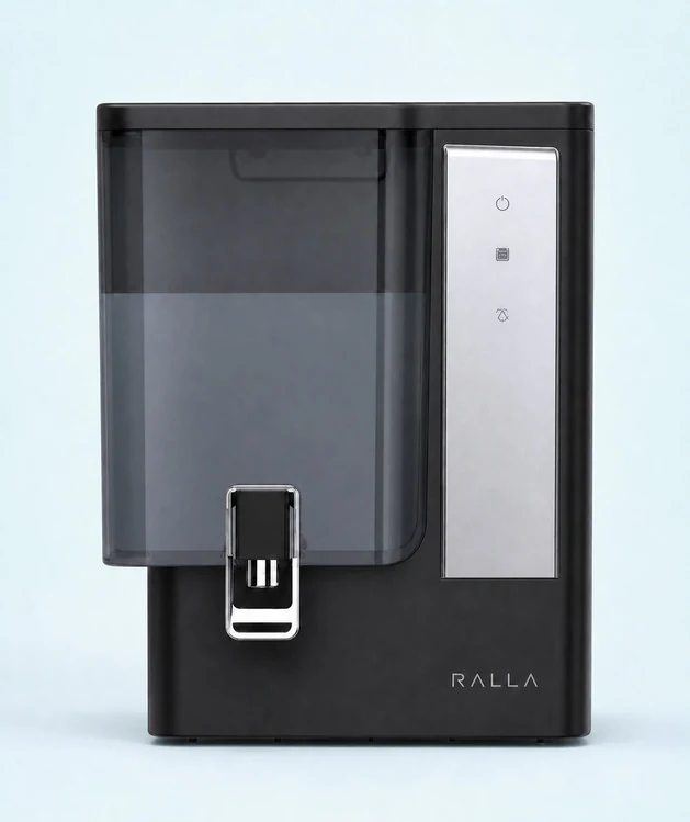
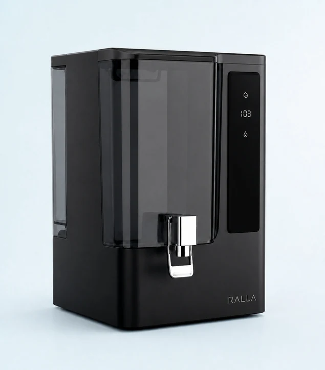
Geist typography and a restrained water-blue palette carry the identity into the website. Clear product families create a practical route through Basic, Pro, Pro Plus and Ultra. Product education, shopping and care belong to the same calm experience.
The whole picture
A considered system for a familiar daily ritual.
The identity, campaign direction and website layouts share one idea: make the choice easier to understand. The work shown is the documented design direction, including illustrative campaign and product renders.
Visit Ralla ↗Campaign scenes and product presentations are illustrative renders.
Next project / 02
JS Supply Co ↗
Brand system & e-commerce