
Farmlyf
Packaging & print system
Packaging design
Food & dry fruit
Freshness, with a little more character.
Farmlyf
The project
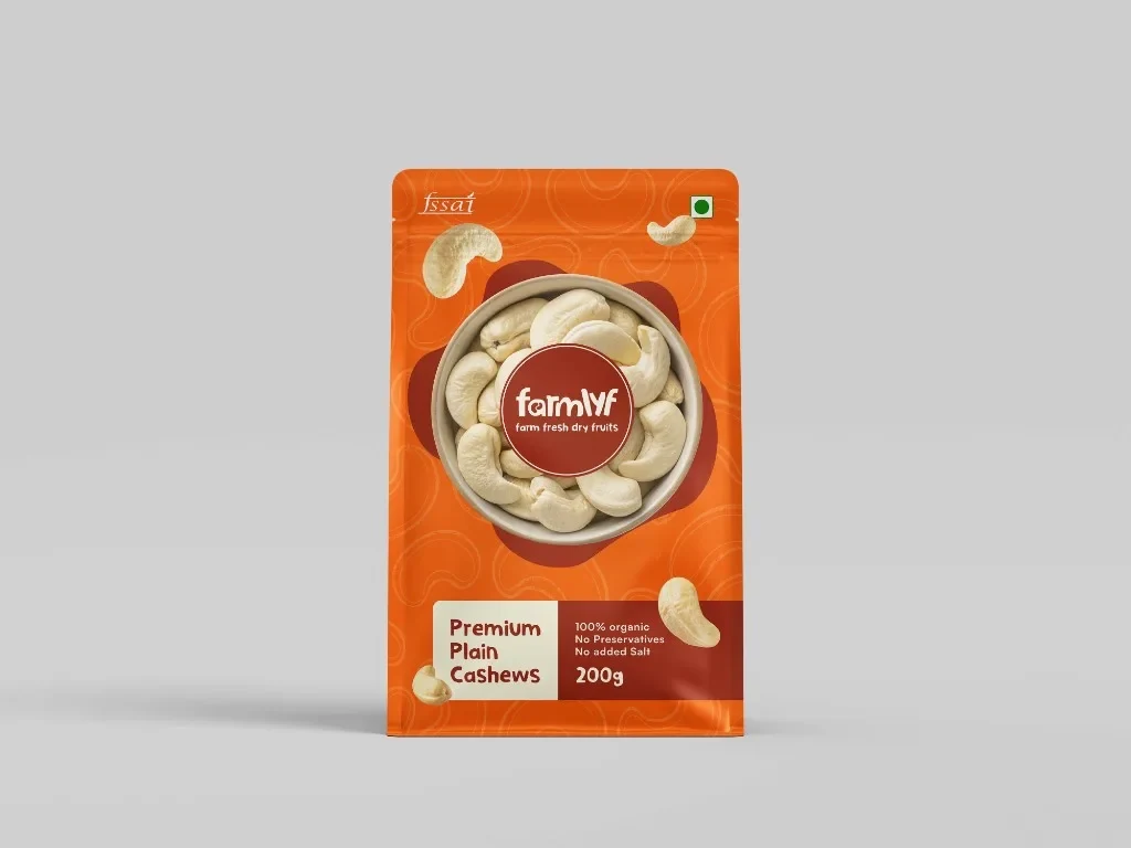
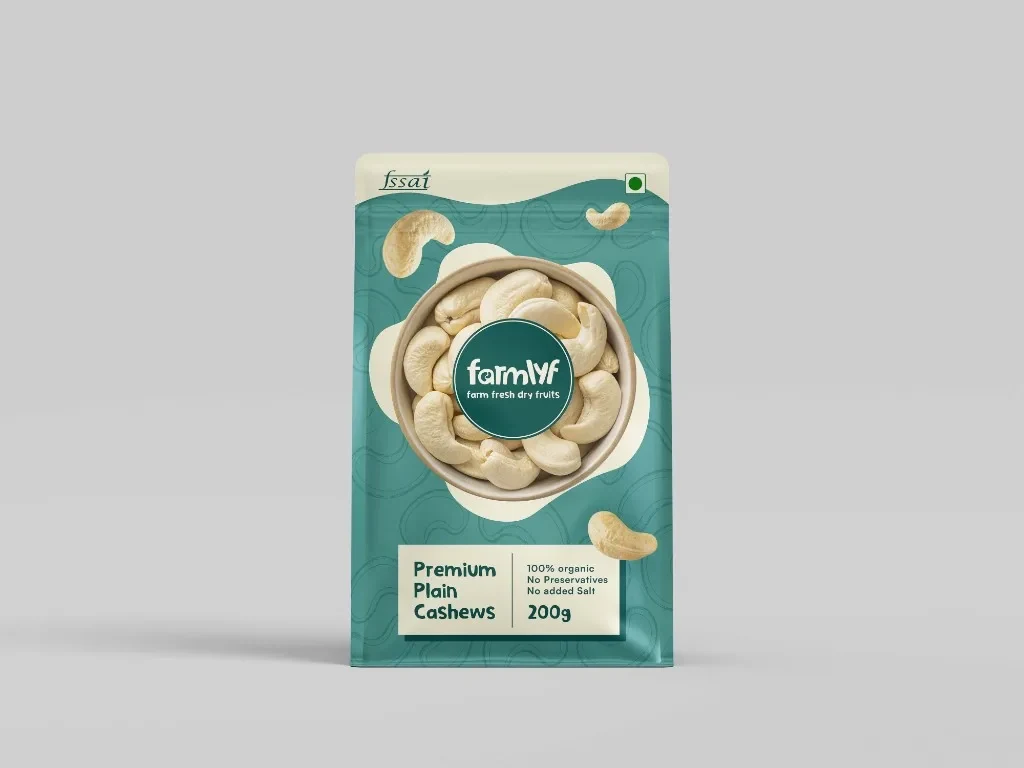
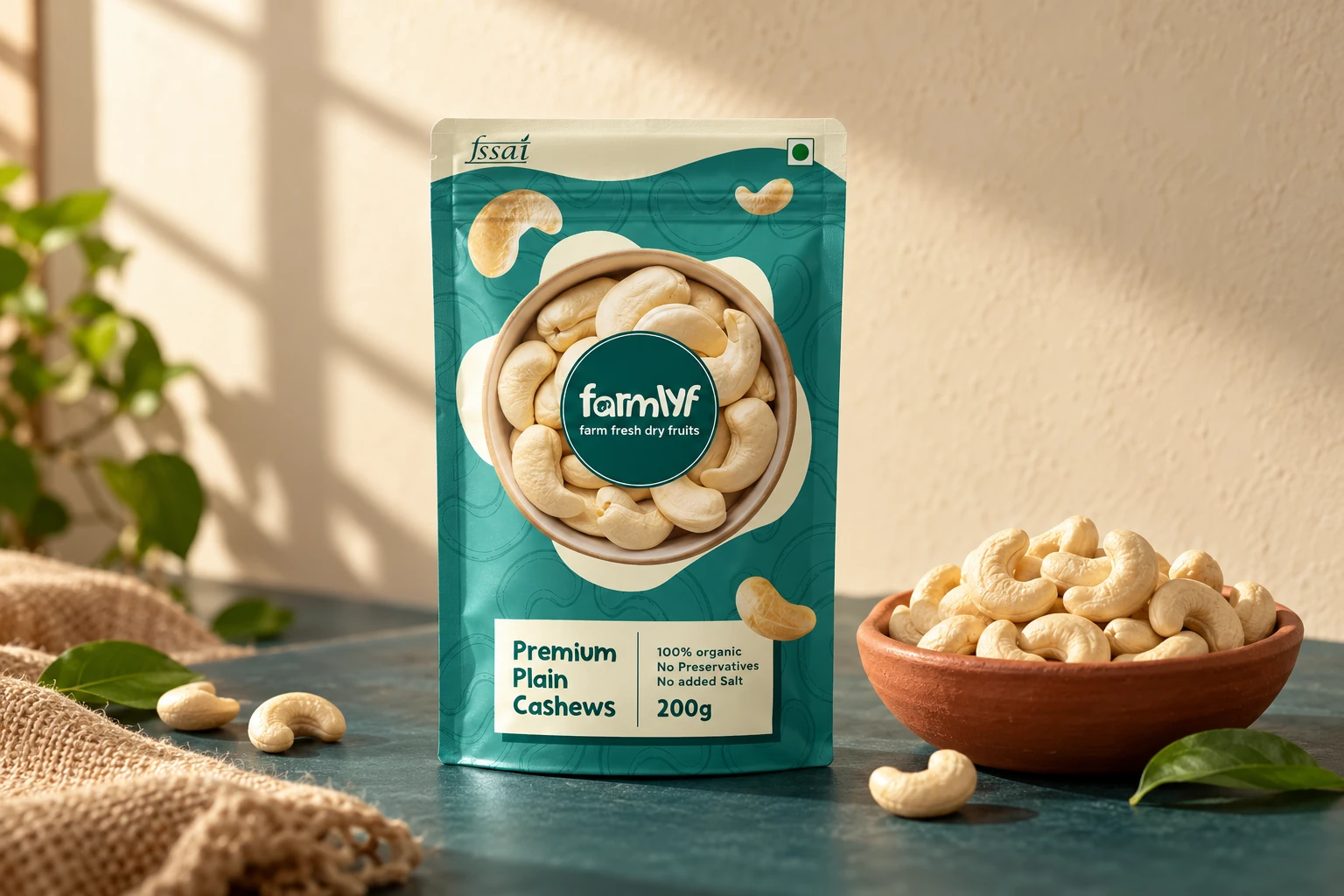
Farmlyf’s packaging needed a recognisable face for its dry-fruit range. The case focuses on the cashew pouch: a product-led composition, a clear front-of-pack hierarchy and two colour treatments that explore the range’s visual language.
- The brief
- Make a familiar pantry product easy to notice and easy to read.
- Our contribution
- Packaging design
Label hierarchy
Print artwork
Vendor specifications
The thinking
Make a familiar pantry product easy to notice and easy to read.
01 / Direction
Let the product lead.
A bowl of cashews takes the centre of the pack, framed by the circular Farmlyf wordmark. The layout makes the food immediately recognisable. Smaller scattered cashew details and fine contour lines give the background its own rhythm without competing with the main image.
02 / Design
Build a dependable reading order.
The lower panel groups the product name, weight and supporting information. The relationship between image, wordmark and label remains steady across the orange and teal treatments. That consistency gives colour room to create character while the structure stays familiar.
03 / In use
Think beyond the first render.
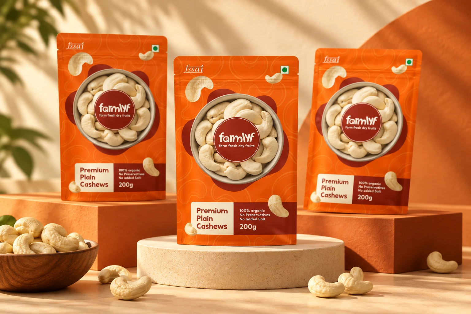
Packaging design has to translate into repeatable artwork. Label layout and vendor specifications support the production conversation. A new family presentation brings the existing orange pouch into a warm studio composition, showing how the packaging can become the campaign’s central asset.
The whole picture
A confident pack, built around the food.
A product-first packaging direction with a repeatable hierarchy and a vivid colour language. Original orange and teal designs are shown with a generated campaign mockup. This case makes no claim about food certification or commercial results.
The hero is a generated presentation mockup. Product and certification text appears as supplied artwork and has not been independently verified.
Next project / 11
Velou ↗
Marketing design & technology